
China Renewables and PR

Let’s see the whole story. This first chart shows total electricity generation in China by source from 2015 to 2024.
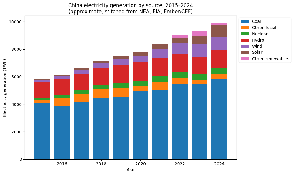
The units on the vertical axis are energy. You get kWh (kilowatt-hours) on your electricity bill, TWh are just a billion of them. Over 10 years China has increased its electricity production by over 70%. That’s a lot - so they are building everything they can: coal, wind, solar and nuclear. (My guess is that gas hasn’t grown much because the fuel is currently expensive, and large hydro schemes take a long time to build).
Here are the changes by year:
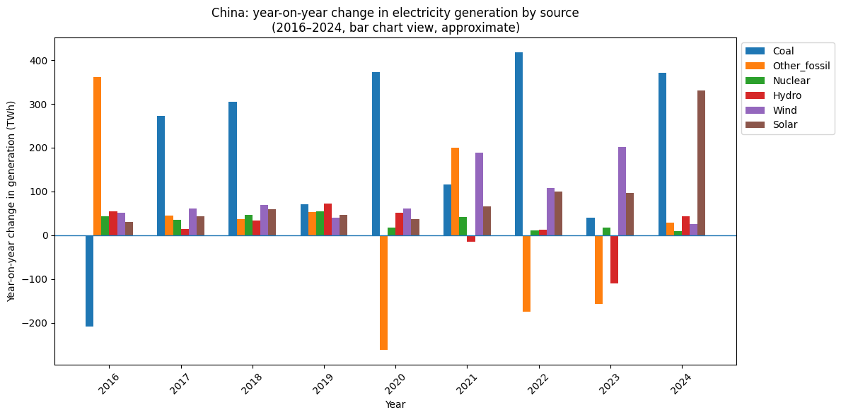
Why is orange (gas) negative? Did they decommission gas plants? No. They aren’t running them as much. If the fuel is really expensive and you have coal plants on standby you run them instead.
Unless you really care about CO2 emissions in which case you would run gas before coal - but that’s a subject for another day.
Notice that there was a big increase in coal generation in 2020, 2022 and 2024. I’m reasonably sure that this isn’t “finish lots of coal plants in even years and then turn them on”. Instead, the underlying coal capacity is climbing more smoothly; what jumps around is how hard the fleet is run in each year (hydro availability, demand spikes, etc.), which makes the coal bar look ‘lumpy’.
So in 2024 coal generation increased more than solar. But in 2025... I don’t have the numbers, but a friend sent me a graph he got from a famous person on Twitter:
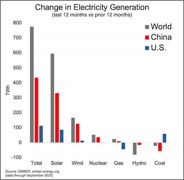
Maybe it’s the start of a new trend, or maybe it’s like 2023, 2021 and 2019.
Here’s another way to see the data. Changes in installed capacity:
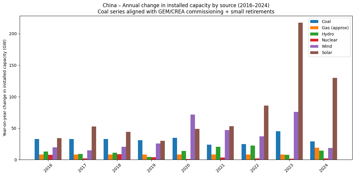
Look - solar absolutely dominates. But check back to the earlier graph of changes. 2024 shows coal increasing more than solar. Can both be true?
The key is capacity factor.
You can run a coal plant for all 8,760 hours of the year if you want. Occasional planned and unplanned outages mean that over a few years a baseload plant might run for 90–95% of the time on average. The average for coal plants in China is around 50% (note 2).
You can’t “run” solar panels 8,760 hours because the sun goes down, it’s not directly overhead all the time, and sometimes clouds come out. The average capacity factor for solar is around 15%.
So a new 1 GW coal plant produces roughly three times as much electricity over a year as a new 1 GW solar farm.
For the next graph I’ve taken the GW additions each year and multiplied by a representative capacity factor for each technology, to get a rough ‘average power added’ in GW-equivalent:
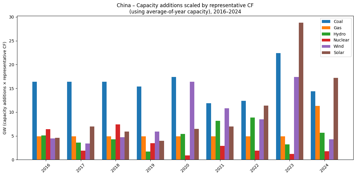
It’s not a standard metric, so it’s not a perfect picture, but it helps get us closer to reality - we see coal and solar are getting added at somewhat “equal rates”.
Now let’s see the 2015-2024 change in the key items:
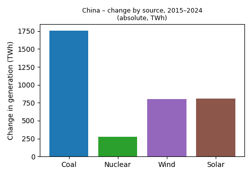
Coal dominates!
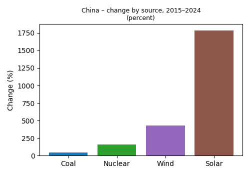
Solar dominates!
A graph for everyone.
How to tell three completely different stories with the same numbers
With these graphs you can see how easy it is to do perfectly accurate PR:
If you want a “China is still all about coal” story, you show the absolute TWh change: coal has added more electricity than any other single source.
If you want a “China is racing ahead on renewables” story, you show the percent changes: solar is up almost nineteen-fold, wind by a factor of five, while coal is only up ~40%.
If you want an “it’s basically sorted now” story, you show a single year like the Ember chart from Twitter, where the latest 12-month increment from solar and wind shoots up while coal decreases.
All three are based on the same underlying physics: same plants, same electrons, same tonnes of coal burned. The difference is just which slice of the data you choose to highlight and whether you talk about flows (TWh), capacity (GW), percent growth, or one lucky year.
Notes
Commissioning numbers 2015, 2020–24 and the 2016–20 average come from CEC / Global Coal Plant Tracker / GEM–CREA reports. The 2016–19 values are adjusted to match the stated 2016–20 average; retirements are assumed at 3 GW/year to 2020 and 2 GW/year thereafter (2021 retirements documented as 2.1 GW). Net additions are therefore approximate but broadly consistent with the main public datasets.
If you grew up with a mental picture of coal running at 90% utilisation, that was an engineering ideal for individual baseload units—not the fleet. In practice, coal fleets in places like Australia and the US have run at ~60% on average for decades. China’s coal fleet today is lower still, around 50% CF, because the country deliberately built a lot of ‘extra’ coal capacity for security, much of which now runs mid-merit or as backup to hydro, nuclear, wind and solar. So the low CF is not a sign that coal plants are badly built; it’s a sign the system is over-supplied with coal capacity and is leaning more on other sources when they’re available.
The actual problem here is about coal related CO2 emissions. While China pumped up its power generation from coal by ~50% over the last 10 years, those emissions were reported flat..
Fantastic! Reminds me of
https://www.noahpinion.blog/p/how-not-to-be-fooled-by-viral-charts
https://www.noahpinion.blog/p/how-not-to-be-fooled-by-viral-charts-563