
Germany and Renewables

In China: Renewables and PR we saw big growth in both coal and solar over the last decade. We also saw how easy it is to present the same underlying data in very different ways, depending on the story you want to tell.
Germany is a simpler story from a PR point of view: whichever way you slice it, you see basically the same picture. The interesting part is how they’ve done it. That’s for a follow-up. First, the numbers.
The Big Picture
Here’s Germany’s electricity generation by source. TWh are just like the kWh on your electricity bill, but a billion times bigger.
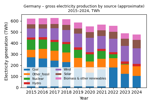
The headline: domestic electricity generation has dropped a lot – by about 150 TWh between 2015 and 2024 (see notes). But demand hasn’t dropped that much.
In 2015 Germany was a net exporter of about 51 TWh. By 2024 it had flipped to about 32 TWh of net imports – none of which appear in the graph above, which shows domestic generation only. In a follow-up we’ll look at these cross-border flows, because they’re central to how a high-renewables grid actually works.
For now, also put a mental asterisk next to “Biomass & other renewables”. Most of that is biomass. It sounds very green but it’s not CO₂-free in the same sense as wind and solar. The good news (for simplification) is that in Germany it hasn’t changed much over this period, so we can mostly ignore it for this story.
Once you adjust for the change in trade balance, implied domestic demand is down by only about 70 TWh. Most of that drop is from heavy industry; household and services use are roughly flat over the decade.
The high-level changes over 2015–2024 are:
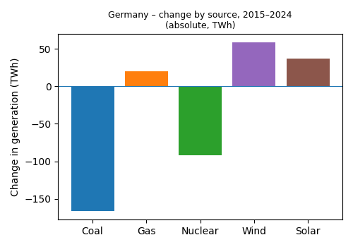
Coal has roughly halved.
Gas has increased, but nowhere near enough to replace coal.
Nuclear has been fully phased out.
Wind is up by about 75%.
Solar has roughly doubled, but from a much lower base than wind.
Year-to-year Changes
Here’s the year-on-year change in generation by source – the same data as the first graph, but shown as annual deltas:
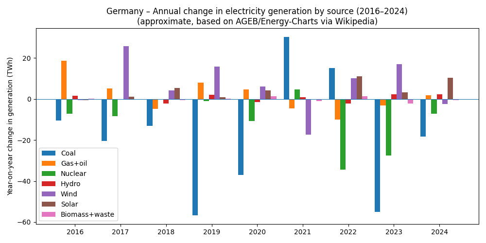
It’s less intuitive at first glance, but it shows how you get from 2015 to 2024:
Big step-downs in coal in several years.
Occasional bumps in gas when the system needs backup.
Wind and solar adding useful chunks in most years, with some flat or bad-wind years.
Nuclear dropping in a couple of big, discrete chunks as plants are shut down.
Capacity Additions: Nameplate vs Reality
Now look at capacity additions – the “nameplate” MW or GW that always get cited in press releases:
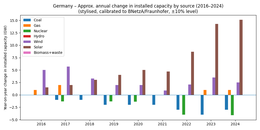
If you read the China piece, you’ll remember we rescaled those capacity additions by capacity factor (CF).
A coal plant could in principle run all 8,760 hours of the year at full power (so CF up to ~100%), though in practice it’s less.
Solar cannot: there’s night, lower sun angles, and clouds.
Wind turbines also only produce a fraction of their nameplate rating over the year.
So “We added 10 GW of solar!” sounds like 10 GW of new coal-equivalent, but it isn’t. That’s why nameplate additions alone always flatter solar and wind.
Here’s the more realistic picture: capacity added or retired, scaled by a representative capacity factor for each source – i.e. “how much steady output would this capacity be equivalent to, if it ran like it typically does?”:
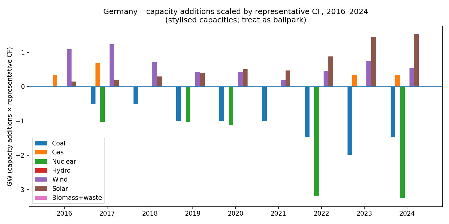
This isn’t a standard metric, and the CF assumptions are approximate, but it nudges us closer to reality: coal retirements are big negative chunks; wind and especially solar additions are respectable but not magic “coal replacement machines”.
The Decade Shift: Absolute and Percentage Changes
Here’s the absolute change in generation over the decade:
And here’s the percentage change:
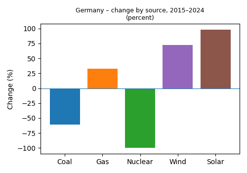
Unlike China – where the same kind of graphs can tell wildly different stories depending on whether you look at absolute TWh, percentage, or “scaled capacity” – Germany’s charts all rhyme:
Coal down hard.
Nuclear to zero.
Wind and solar way up.
Gas nudged up, but not massively.
The story is robust to how you slice it.
How Big are Wind and Solar Now?
On the official gross-generation numbers:
2015
Wind: 12.4% of generation
Solar: 5.9%
Wind + solar = 18% of total generation.
2024
Wind: 27.7%
Solar: 14.8%
Wind + solar = 42.5% of total generation.
So you can say, quite fairly:
“In one decade, wind + solar have taken over an extra quarter of total generation.”
That’s impressive.
It’s also – inevitably – a bit flattering. Suppose Germany in 2024 still had:
the same heavy-industry demand as 2015, and
was still a net exporter instead of a net importer.
Then you’d be comparing 2024 wind + solar generation (in TWh) against the 2015 total. On that basis, wind + solar in 2024 are about 33% of 2015 total generation, up from 18%. Same physics, different denominator, less dramatic headline.
Where This is Going
In the next article we’ll look at what’s happening beyond the border:
Germany used to be a big exporter.
Now it often leans on imports when the wind is low or demand is high.
Its neighbours – especially France and the Nordic countries – act as a kind of “extended grid battery”, with nuclear and hydro smoothing out some of Germany’s wind + solar variability.
Imports aren’t just boring footnotes at the bottom of a balance sheet. They’re an integral part of how a high-renewables system behaves. The interesting question is:
What happens on the day when Germany wants to import at the same time as its neighbours also want to import?
Right now, France’s nuclear fleet (yes, fleet – that’s the standard term for a group of reactors) means it’s much less exposed to the weather than Germany is. How long that remains true, and how Europe manages the tug-of-war between wind, solar, nuclear, hydro and gas, is the next part of the story.
Notes
Official total generation in 2015 from AGEB/Destatis is about 647 TWh.
The totals in the stacked graph are about 4–5% lower than that because “other energy sources” – mainly pumped-storage generation and a small mix of miscellaneous fuels – are omitted for clarity.
With the shutdown of Germany's nuclear plants (and possible reopening in the future), loss of natural gas pipeline from Russian and commitment to stop buying fossil fuels from Russia, the situation is only "simple" [consistent] in terms of the values. Pielke focuses on the rate of decarbonation of the economy, which is far too slow everywhere to reach Net Zero emissions by 2050. Nevertheless one of his blog articles endorsed a scenario reaching Net Zero by 2075.
IMO, how much is costs is far more important than exactly where we have gotten to? The Leveled Cost of Electricity Generation is a nearly worthless figure, because prices in the real world are controlled by the law of supply and demand, not the cost of production. Since renewables are not dispatchable when "demanded" a MWh of renewable electricity is worth far less than a MWh that can be usually be delivered when and where needed. In spot markets, renewable generators sometimes bid $0. Grid operators offer huge incentives to those willing to have the supply cut off. Some economist needs to come along and develop a better method that takes into account the true cost of intermittency.
The last time I looked, which was some years ago, German households use of electricity was something like 15% of total energy use per household. Heating with oil or gas was the largest share. Electricity was too expensive to use for anything other than lighting and electronics. I suspect that hasn’t changed.