
UK and Renewables

We looked at the same data for Germany. Let’s do this for the UK.
Here’s electricity generation by source for the UK from 2015 to 2024. Reminder - TWh are just like the kWh on your electricity bill, but a billion times bigger.
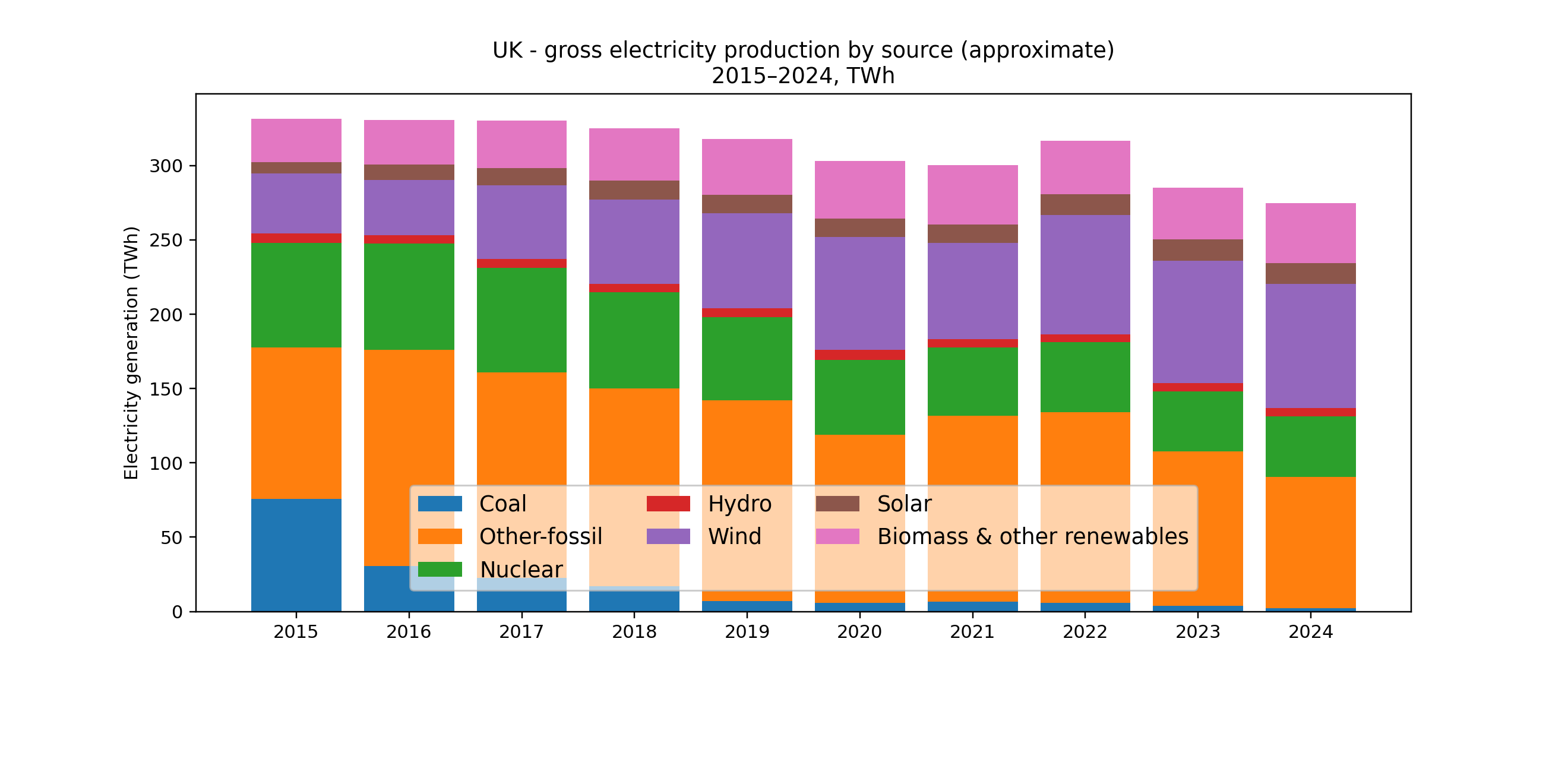
Domestic electricity generation has dropped – by 55 TWh, or 16%, from 2015 to 2024. Demand fell by 31 TWh, or 10%. Net imports increased to make up the balance. We’ll look at this in a follow-up article.
The UK story in one sentence:
Coal collapsed, wind surged, nuclear declined, gas stayed stubbornly central, and biomass became a non-trivial chunk of “renewables”.
Some headline numbers (from these categories):
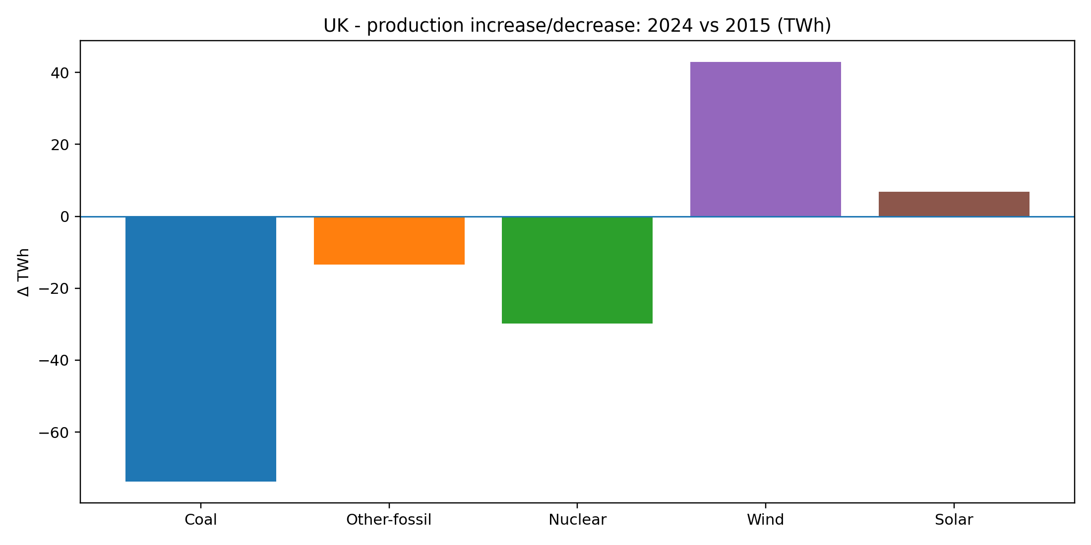
Coal: ~76 TWh (2015) → ~2 TWh (2024). That’s basically a disappearance.
Wind: ~40 TWh → ~83 TWh. Roughly doubled.
Nuclear: ~70 TWh → ~41 TWh. A long slide.
Other fossil (mostly gas): ~102 TWh → ~88 TWh. Down a bit, but still huge.
Biomass & other renewables: ~29 TWh → ~40 TWh. Up meaningfully.
Solar: ~7.5 TWh → ~14 TWh. Up, but not the main character in the UK.
If you squint, the UK is doing two things at once:
Decarbonising by removing coal and adding wind.
Holding onto gas as the system’s structural “backbone”.
That second point is the one that tends to get lost in celebratory headlines.
Year-to-year Changes
Here’s the year-on-year change in generation by source – the same data as the first graph, but shown as annual deltas:
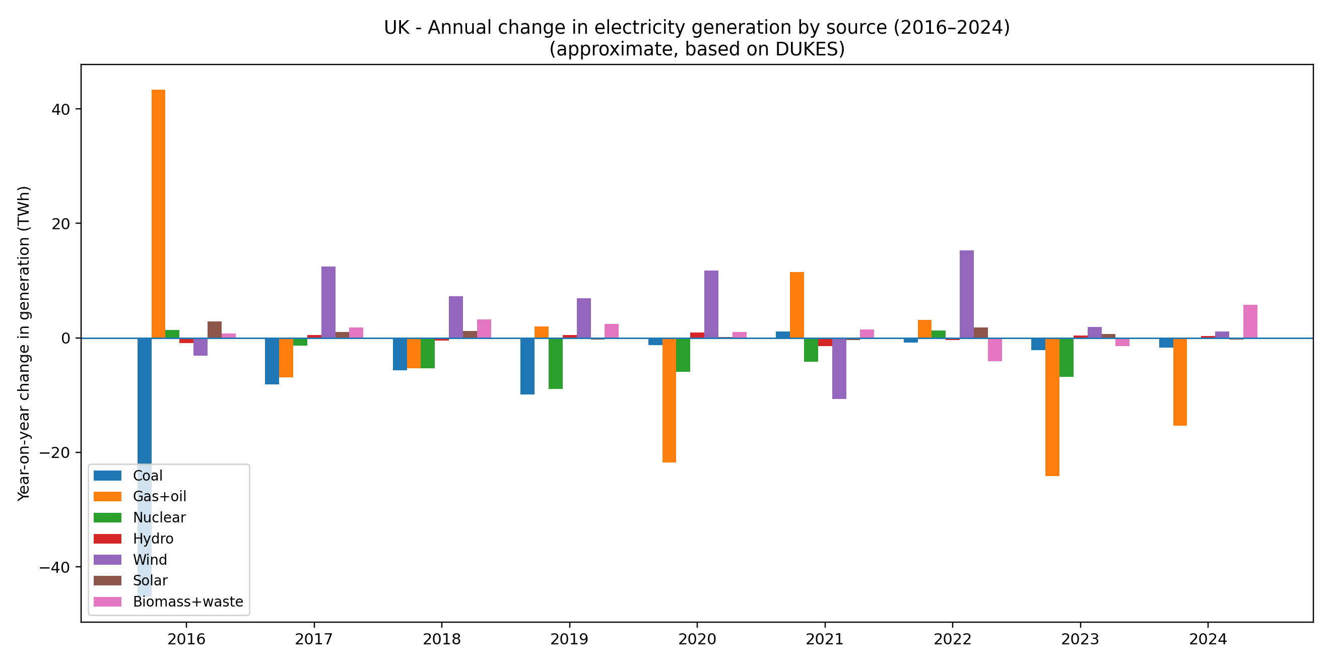
This is the “year-to-year turbulence” view. It answers: what moved the dial each year?
A few patterns jump out:
Coal falls in steps, not smoothly. The UK didn’t gradually “use less coal.” It closed plants and coal output drops hard.
Wind rises in bursts (new capacity coming online), but with big weather-driven wobble on top.
Nuclear mostly trends down with occasional small recoveries—classic aging fleet behaviour.
Gas flexes around everything else. When wind and nuclear are down, gas tends to fill the hole (and vice versa). You can see gas behaving less like a “being phased out” fuel and more like a balancing fuel.
This is one of those graphs that quietly undermines simplistic narratives. The UK didn’t just “replace coal with wind.” It replaced coal with a mix: wind + more biomass + gas doing the heavy lifting of variability.
Capacity Additions: Nameplate vs Reality
Here are capacity additions – the “nameplate” MW or GW that always get cited in press releases:
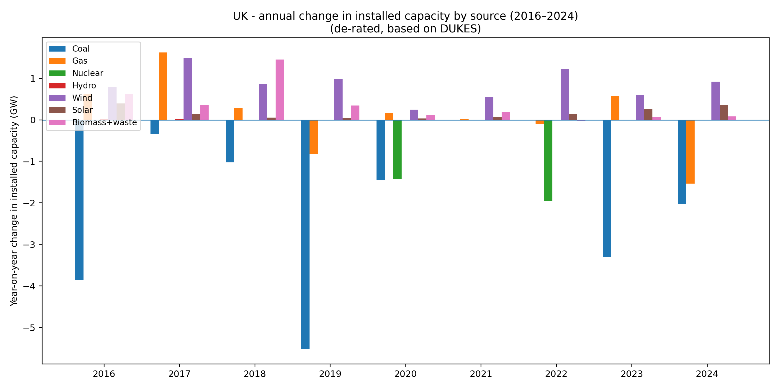
Capacity charts are often used as PR because they’re easy to game: a gigawatt of wind “sounds like” a gigawatt of gas until winter happens.
Still, capacity change tells you what the build/retire machinery is doing:
Coal capacity collapses over the decade. That matches the generation story: coal isn’t “managed down”; it’s shut.
Wind capacity climbs steadily, with some chunky years.
Solar grows, but more modestly than you’d guess (unless you’ve actually live in the UK) from the way solar dominates the social-media imagination.
Other fossil capacity doesn’t vanish. It bounces around. The system still wants dispatchable power.
This is the bit where a grid engineer shrugs and says: “Yes, of course.” Electricity systems are not moral projects; they’re physical machines with a reliability constraint.
As with our China and Germany view, here’s the generation capacity converted into a more realistic picture of what each can produce:
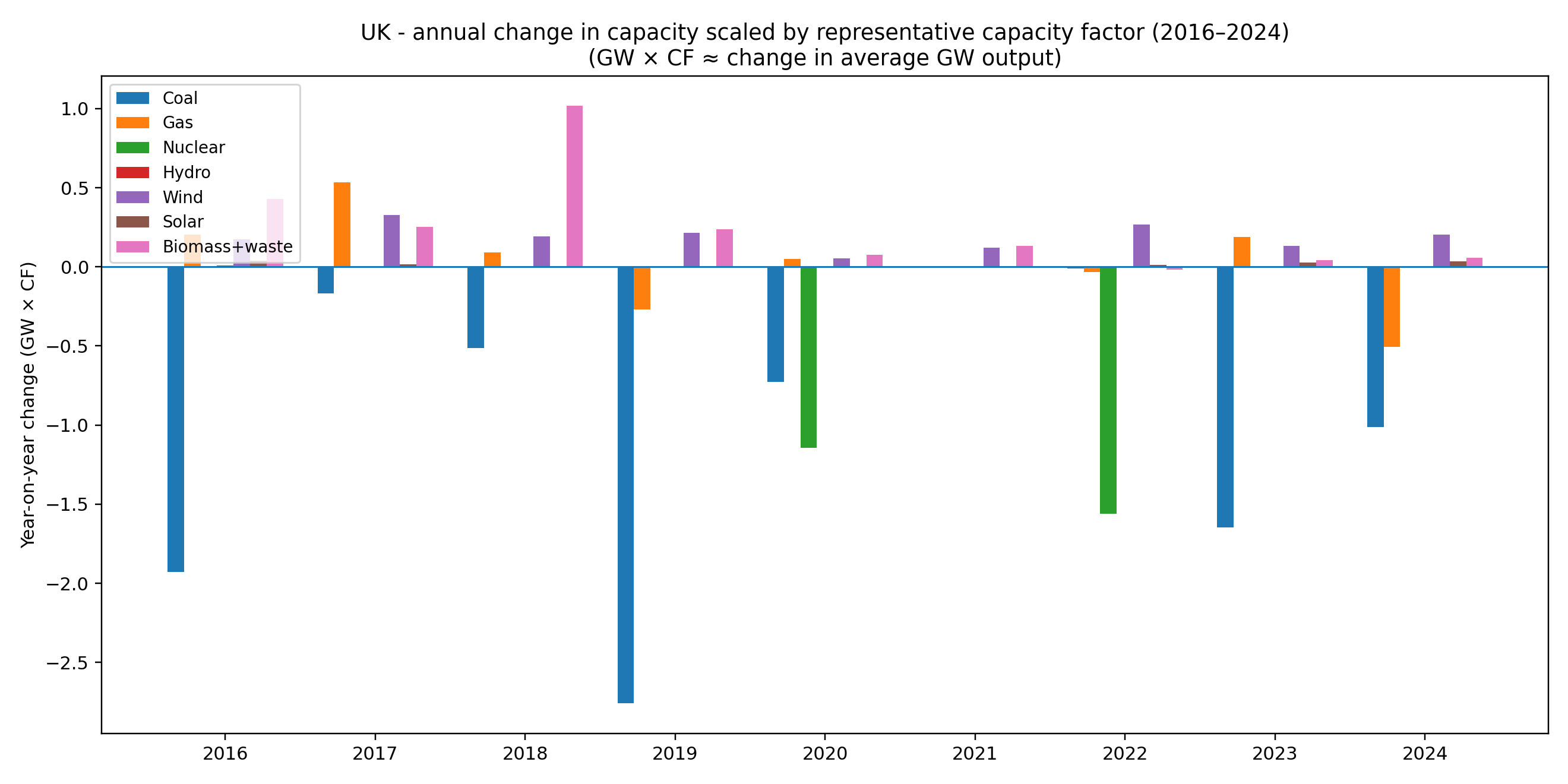
This chart takes the capacity changes and multiplies each technology by a representative capacity factor (CF). It’s a blunt tool, but a useful one.
Interpretation:
1 GW of wind is not 1 GW of average power—it’s more like ~0.3 GW average (order-of-magnitude).
1 GW of nuclear is close to ~0.8 GW average if it’s running well.
Biomass behaves closer to dispatchable plant than wind/solar (higher CF), because it’s burnable fuel.
So this chart asks: If we translate new capacity into rough average output, what’s the trend?
You get a clearer picture of why gas remains central:
Wind additions deliver real energy, but not in a controllable way.
Nuclear retirements remove large chunks of dependable energy.
Biomass additions add energy that looks “renewable” in policy categories but behaves like a fuel.
This chart is also where you start to feel the shape of the follow-up post: if you remove coal and some nuclear, then add variable renewables, the system must compensate with something that can respond quickly (gas, imports, storage, demand response, etc.).
The Decade Shift: Absolute and Percentage Changes
Here’s the absolute change in generation over the decade:
And by percentage:
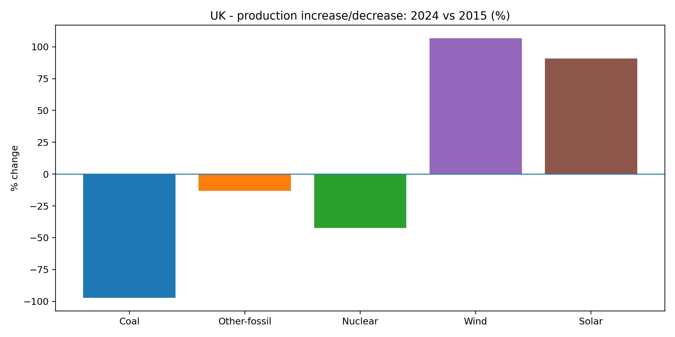
They both paint the same picture.
The political version is: “Coal is gone, renewables are up.”
The engineering version is: “Coal is gone, wind is up, nuclear is down, and gas is still doing a lot of work.”
Both are true; one is incomplete.
“Biomass & other renewables” — what is it?
In UK electricity statistics, this bucket is mostly bioenergy (things you burn), plus tiny amounts of wave/tidal.
What’s being burned?
Wood pellets / woody biomass (including substantial imports, historically)
Waste wood and residues (varies by plant/supply chain)
Energy-from-waste (incineration; mixed fossil + biogenic content)
Biogas (landfill gas, sewage gas, anaerobic digestion)
And this brings us to the question curious readers ask:
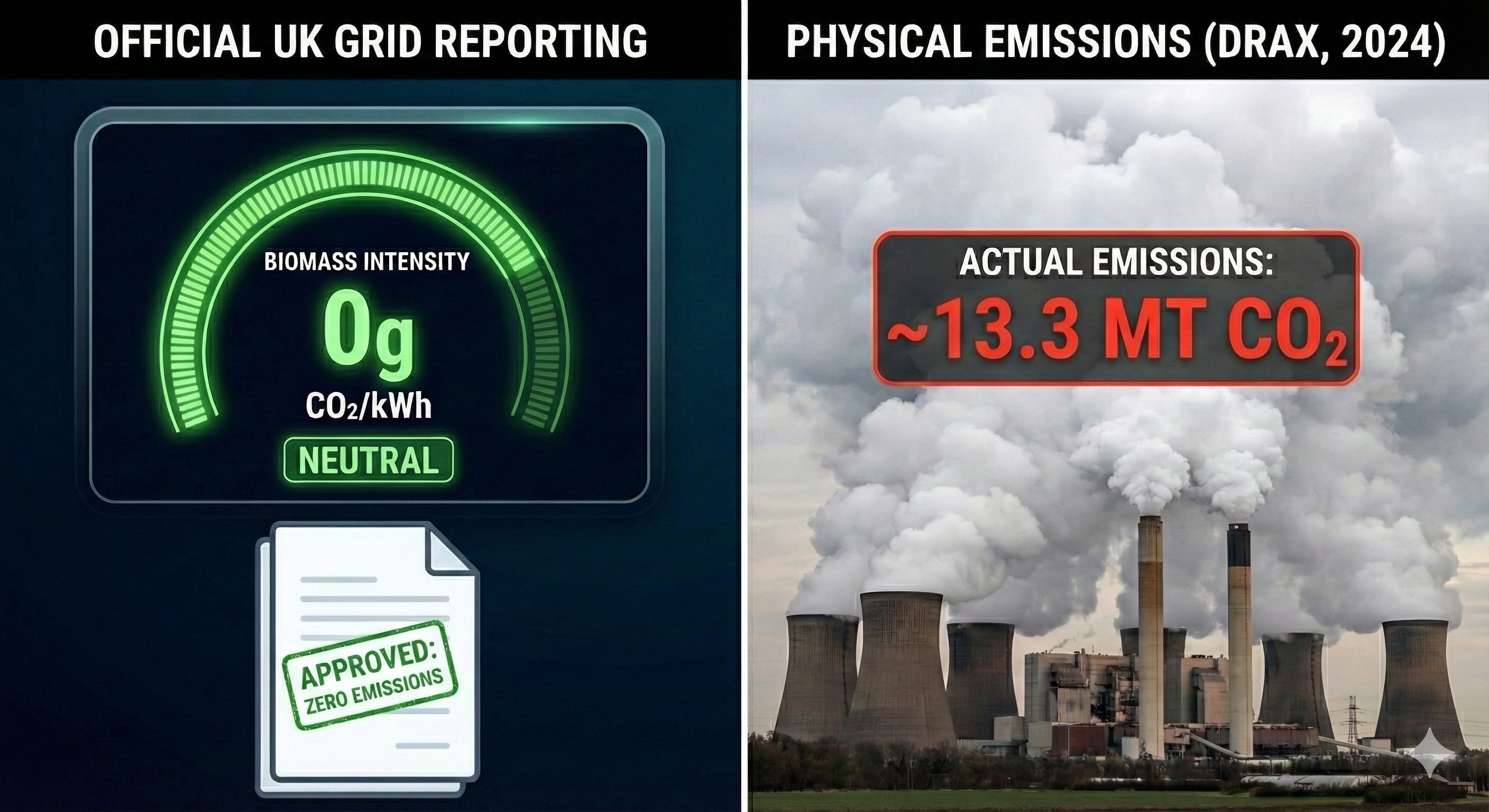
Is biomass really “CO₂ neutral”?
We’ll come back to this. But as a spicy placeholder, in 2024, Drax emitted approximately 13.3 million tonnes of CO2.
In official UK grid intensity figures, this is reported as 0g CO2/kWh, despite the physical stack emissions being higher per MWh than a coal plant.
Where this is Heading
Just like with Germany, we’ll primarily look at the imports and the biomass accounting fiction. If you shut down your coal plants and it’s not windy (or sunny — and if you haven’t lived there, lack of sunshine is a key feature), how do you keep the lights on?
Notes
Some small categories in the charts are rolled up or omitted for clarity.
This is generation within the UK, not “electricity used in the UK after imports/exports.”
What explains that drop in demand? More efficient electric appliances/machines/devices? Weather patterns? Other?
Not an expert but I'd think demand would ~track GDP, all things considered ... not even taking into account EVs
Is it really the case that aggregate demand for electricity is down in the UK? Or just demand for domestically generated electricity?